

One replacement pot light can look blue-white beside warm neighbours, or two areas of an open-plan home can feel disconnected even though both are bright. This is often described as “one light is wrong,” yet a visible colour difference is not automatically an electrical defect. Colour temperature, product design, age, dimming behaviour, surrounding finishes and even different tasks in adjoining rooms can explain the appearance. The goal is to understand what is installed and what the room should feel like.
Many Milton homes combine builder-installed recessed fixtures with later pendants, lamps or under-cabinet LEDs. A nominal “warm white” bought years after the original lights may not match them. The issue is especially obvious across a clean ceiling row or when a new unit is placed next to the television. The fix may be a matching product, a consistent group replacement or a deliberate lighting-zone plan; a single universal Kelvin prescription cannot suit every room.
What do Kelvin numbers mean in a room?
Correlated colour temperature is expressed in kelvins, often written K. Around 2700K generally appears warm and familiar from traditional residential lamps. Around 3000K remains warm but can look a little cleaner. Around 3500K sits between warm and cooler neutral appearances. Around 4000K can look cooler and more neutral, often considered for some task areas. These are descriptive choices, not a ladder from bad to good. The appearance depends on the specific fixture, surfaces, daylight and adjacent sources.
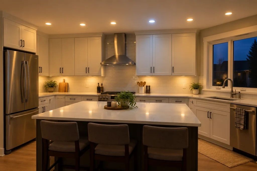
Consider a kitchen with 3000K ceiling lights and a 4000K under-cabinet strip. That difference may look intentional when each layer has a separate role, or jarring if both shine onto the same pale countertop. A 2700K living-room lamp next to 4000K ceiling spots may make the spots feel harsher than they do alone. A basement painted in warm beige can read differently from a home office with cool grey walls, even using nominally identical fixtures.
Kelvin is not the only colour property. Colour rendering affects how food, skin, paint and materials appear. Two brands carrying the same Kelvin label can still show a different tint, rendering or lens appearance. A dim-to-warm lamp may intentionally change its apparent colour as it dims, whereas a conventional LED may largely retain its tone. Check the actual product characteristics rather than assuming labels alone guarantee a perfect match.
Find out which source looks different

Compare the room in the daytime and after dark with each normal zone on. Is one pot light different, a whole recently upgraded row different, or a task layer such as pendants or cabinet light creating contrast? Does the variation appear only when dimmed? Has a colour-selectable fixture been moved to another setting? These observations can be made from normal use without opening a ceiling fitting or control.
A single mismatched light may have been replaced with a different model, Kelvin setting or optical design. Several older fixtures may have drifted in appearance, or their once-identical lamps could have been replaced at different times. An open kitchen and family room may simply have inherited two separate product choices. If a light also flickers, buzzes or fails, that operational symptom warrants its own assessment; see flickering pot lights and lights not working.
Take photographs in consistent exposure if possible, but know that phone cameras adjust white balance automatically. Photos can show the relationship between areas while being unreliable as exact colour proof. Packaging, old invoices and fixture model numbers are valuable. The best confirmation is to look at the actual products operating together and, when feasible, compare proposed replacements in the room.
Aim for continuity without making every layer identical
Connected spaces benefit from a coherent baseline. Pot lights visible in one continuous ceiling often look best when their colour and trim appearance belong to the same family. But a dining pendant can be somewhat warmer than a kitchen task light by design. A bedroom can prioritize a warmer, gentler evening setting, while a home office may favour clearer task lighting. The choice should follow room use, not a decree that every fixture in the house must be exactly 3000K.
The relationship among finishes matters. Wood cabinetry, stone colour, upholstery, art and paint can all change under different sources. In a kitchen, proposed light should be judged on the counter and cabinet faces as well as the floor. In a living room, check faces and wall textures from seating positions. A colour change that looks pleasing under a fixture can make nearby surfaces feel flat or overcool.
Daylight complicates comparison. A north-facing room may look cooler by day than a south-facing one; evening artificial light can reveal mismatches that are invisible at noon. Dimming can also create an apparent contrast when one group drops much lower than the others. Separate zones can let warm lounge light and practical kitchen light coexist. Interior pot lights and kitchen lighting layers discuss continuity across connected rooms.
Replacing one unit versus coordinating a group
If the identical approved model remains available, replacing one failed product may preserve appearance. Confirm the exact Kelvin setting, output, beam, lens, trim and dimming performance before ordering. If the model is discontinued, a nominal same-size 3000K replacement may still stand out because of different tint or optical distribution. The homeowner can weigh one visible mismatch against replacing a defined group for consistent results.
For older recessed housings, compatible LED retrofit products need to suit the installed housing and instructions. The presence of an old can does not automatically mean it has to be removed, but not every LED kit is an appropriate conversion. A complete LED pot-light upgrade may be justified if lamps, trims and dimmers are already inconsistent, but the existing conditions should be evaluated first. Old recessed lighting explores those options.
If the ceiling lights are consistent but a cabinet strip differs, the task-light layer may be changed independently. If pendants use replaceable lamps, those may offer another route. The proposal should specify which groups are being standardized, what target colour and rendering characteristics are intended, and whether control zones need updating. No responsible quote can guarantee a perfect match solely from a Kelvin number in a product listing.
Electrical and approval considerations
Colour selection is a design decision; product replacement involving electrical work still has Ontario requirements. ESA says a business hired for electrical work in a home must be a Licensed Electrical Contractor. Almost all electrical work requires a Notification of Work filed by the person doing the work before it starts, subject to narrow conditions for some replacements. Recessed-lighting work should not be presumed exempt. ESA’s review process depends on the work, and passed work receives a Certificate of Acceptance. See ESA electrical requirements.
Fixtures, LED drivers and other electrical products need recognized Ontario approval markings, and each must suit its installation. Approval and visual match are separate checks. A product with the right 3000K label but without the required recognized marking is not the right choice. The approved products guide covers what a homeowner can ask to see.
Questions homeowners ask
Is 3000K better than 4000K for pot lights?
Neither is automatically better. 3000K often supports a warm residential feel; 4000K can appear clearer or cooler and may suit some tasks. View the choice alongside daylight, paint, cabinets and neighbouring sources, and make connected rooms visually coherent. 3000K versus 4000K provides a fuller comparison.
Can different brands with the same Kelvin number match?
They can be close, but there is no guarantee. Tint, rendering, beam, diffusion and dimming can differ. Compare actual products or exact product data if a seamless row matters.
Is one cooler pot light a sign of failure?
Not necessarily. It may be a different setting or replacement model. If its colour changed suddenly, it flickers or it no longer behaves normally, have the product and circuit assessed. Colour alone does not establish an electrical cause.
Tell us what needs to look consistent
Use contact to share which room or ceiling run differs, what was recently replaced and the existing model information if available. Include photos of the lights operating together and your preferred atmosphere. A thoughtful layout and design discussion can coordinate colour with beam, output, decorative fixtures and controls instead of chasing a single number.