
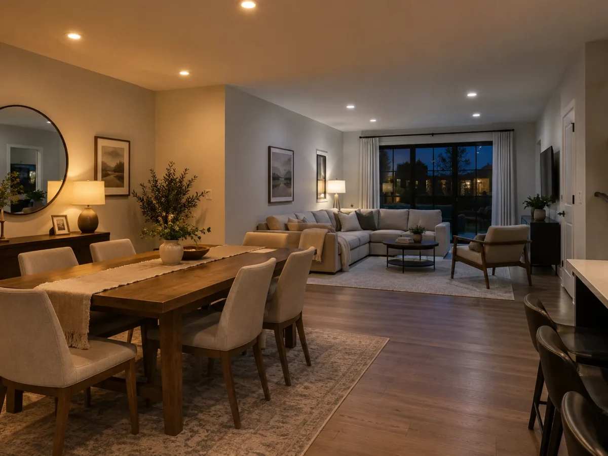
The numbers 3000K and 4000K describe correlated colour temperature, which is how warm or cool the white light appears. Around 3000K generally reads warmer; 4000K generally reads more neutral and cooler by comparison. Neither is a universal winner. The decision depends on the finishes, daylight, other light sources and how the room should feel during its main hours of use. A product’s colour rendering, output, beam and diffusion also affect appearance, so do not select a lighting plan by the Kelvin number alone.
What changes when the Kelvin number changes?
A warmer white can make timber, warm stone and evening seating areas feel inviting. A more neutral white can feel clearer on certain work surfaces and in contemporary finishes. Those are tendencies rather than promises. A poorly placed 3000K fixture can still cause glare; a well-shielded 4000K light can look comfortable when it belongs with the room. The Kelvin rating does not tell you whether the LED renders saturated colours accurately, how strong its output is or where the beam lands.
Compare candidate lights on the actual materials if possible. A showroom wall and your cabinetry may reflect light differently. Paint can shift appearance under electric light; some white finishes look creamier under warmer light and cooler under 4000K. Test in the evening as well as daylight. View the candidate fixture from normal standing and seated positions, not just while staring directly into the source. That assessment is more reliable than voting on a product photo.
Kitchens need more than a Kelvin decision
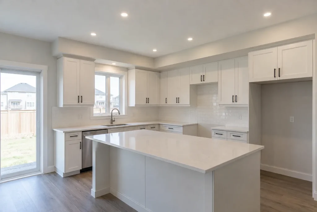
Some homeowners prefer 4000K over a preparation counter because it appears crisp; others prefer 3000K so the kitchen feels connected to warm dining and living areas. The important question is how the pot lights, pendants and under-cabinet sources look together. Mismatched white temperatures can be noticeable when they illuminate the same counter. They can also be used intentionally if the layers have distinct jobs and are separately controlled, but that requires a deliberate design.
Colour temperature does not fix shadows cast by wall cabinets. The kitchen lighting layers guide places task lighting at the work surface and uses pot lights for broader support. If a counter looks dull, consider placement, beam and colour rendering before assuming a shift from 3000K to 4000K is the solution. High-gloss counters may show a harsh reflection at either temperature if the fixture is exposed or badly positioned.
Living rooms and bedrooms
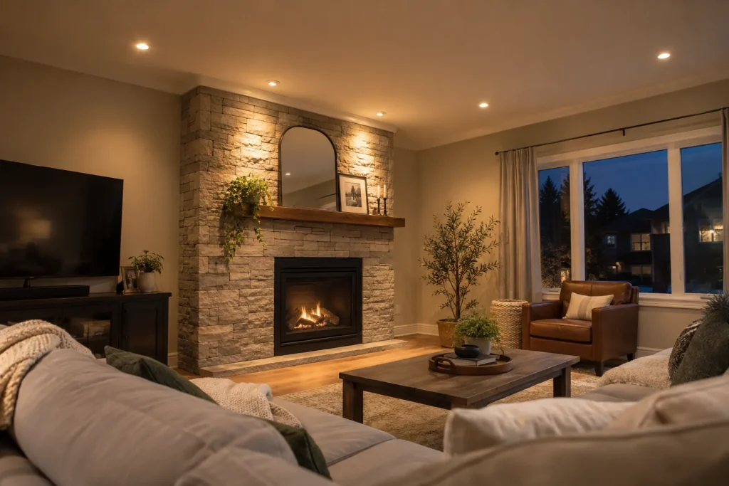
These rooms often serve a calmer evening role, which leads many people toward warmer light. Yet a living room may also contain art, reading chairs, a game table or home office use. Separate zones and compatible dimming can provide range without forcing all tasks into one scene. A table lamp may have a different lamp colour from the ceiling fixtures; view them together rather than judging each on its own. Glare onto a TV screen is a placement issue, not a Kelvin issue.
For a bedroom, consider dressing, reading and winding down. Pot lights could support wardrobes and circulation while bedside fixtures handle reading. A uniform bright ceiling at any temperature can feel less restful than layers under separate controls. The bedroom lighting service and living-room lighting service explore layouts tied to actual use.
Bathrooms, basements and offices
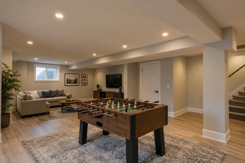
At a bathroom mirror, useful front-facing light and colour rendering matter. Pot lights behind someone’s head can create facial shadows regardless of temperature. Shower and other damp or wet applications also require products appropriate for the location; colour choice cannot replace that suitability check. In a basement, small windows and low ceilings can exaggerate differences between rooms. Consistency across connected areas often helps, while task spaces can have separately controlled light.
A home office demands readable documents and comfortable screen use. Some people favour neutral white when concentrating, but output, diffusion and screen reflections may matter more. If the office is part of a shared family room, a separate desk light and lighting zone may be a better answer than turning the whole room 4000K. A choice that feels energetic during work should still be pleasant when the room changes purpose.
Connected rooms and transition points
An open kitchen, dining and living area is viewed as one composition. Dramatic shifts in white appearance between adjacent downlights can look accidental. Consider using a consistent base colour in the pot lights and changing mood with intensity and decorative layers. A separate pendant can be visibly warmer if that contrast is intentional, but test it on the same cabinet and tabletop surfaces. Long sight lines matter: stand at the entry and at seating positions to judge the transition.
Existing bulbs complicate the decision. A new bank of recessed LEDs may make older lamps look yellow or blue by comparison. List every lamp and integrated fixture that will remain. Some LED products offer selectable colour settings, but the selected setting should be documented and kept consistent where appropriate. Check whether a proposed tunable or smart system behaves as expected with its controls; a marketing claim is not enough to establish compatibility.
Outdoor soffits and entry lighting
Warm exterior light often feels residential and can reduce the harsh appearance of a very bright roofline. A neutral white may suit a different architectural finish or security task. Neither justifies excess light shining into neighbours’ windows. Output, beam control, aiming and switching are decisive. Outdoor locations require a fixture suited to the exposure, and protected soffit conditions should be assessed rather than assuming every exterior product rating is interchangeable.
Look at the building after dark from the sidewalk and from inside windows. A series of bright points can dominate the façade even at a warm Kelvin rating. The soffit layout guide discusses rhythm, glare and control; exterior and soffit pot lights covers the installation service. Make the night view comfortable before optimizing a number on the package.
Product quality and controls
Different products both labelled 3000K may look subtly different. Colour rendering, manufacturer tolerances, diffuser design and dimming behaviour affect the final result. Request a consistent product family where lights share a room. Verify the exact model and any selectable settings. If warm-dim or tunable products are proposed, ask how their behaviour changes at low settings and what controller is required. A standard fixed-3000K fixture simply gets dimmer; it should not be assumed to change colour when dimmed.
Check the approval and application information for the complete electrical product, particularly around drivers and exterior locations. Ontario’s recognized certification marks provide the official reference for approval marks. The approved LED guide explains what to examine on a package and the physical product.
A simple selection exercise
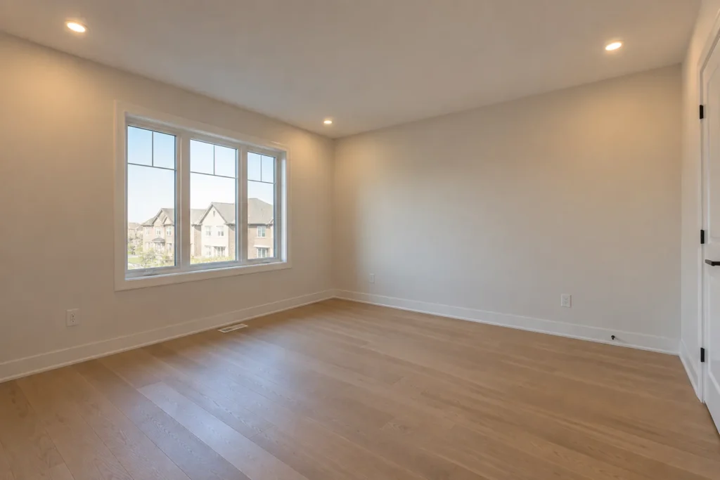
Choose two suitable candidate products with comparable output and beam, one at each preferred temperature. Test them against the actual flooring, countertop or wall finish. Compare them with the existing pendants, lamps and cabinet lighting. Repeat the comparison after sunset and at the dimmer setting you expect to use. Decide whether one colour unifies connected rooms or whether a separate task layer can carry a different appearance. Then record the product and chosen setting in the quotation.
Is 4000K automatically brighter than 3000K?
No. Brightness is connected to output, optical distribution and perception; two products at different Kelvin ratings may have different lumen values. Compare actual specifications and how the light lands.
Can I mix 3000K and 4000K?
Yes, when layers and zones are deliberately separated. Randomly mixing them in one visible row can look inconsistent. View candidate lights on the room’s finishes and consider all the light sources that remain.
If you are planning a pot light installation, share photos of the room and finishes with your estimate request. The right colour choice is the one that supports the entire room, not just the ceiling.