

Both 3000K and 4000K can work in a Milton home. Around 3000K looks warmer; 4000K looks more neutral or cool by comparison. Neither number tells you whether a fixture is bright enough, comfortable to view or well positioned for a task. A useful choice considers the surfaces being lit, the sources that remain in adjacent rooms and how the space feels after dark. The best answer may even use different sources in distinct controlled layers, although random mixing in one visible row can look accidental.
Begin with an actual finish swatch
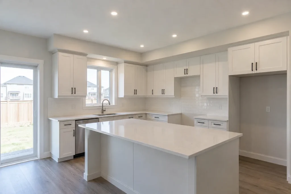
Imagine a white kitchen cabinet door beside a warm oak floor and a grey stone counter. Under two candidate lights, the door, floor and stone can each shift in appearance. A homeowner might prefer one temperature on the counter while another feels better across the whole open plan. That is why an isolated lamp demonstration is insufficient. Compare candidate lights on the finish materials in the space where they will be installed, at the time of day electric lighting matters most.
View the result at full and lower output. Dimming may make the room less intense, but most fixed-colour LED products do not automatically grow warmer like an incandescent lamp. A warm-dim or tunable product is a distinct specification that needs the right controls. Make sure a sales description does not lead you to expect colour change from a standard fixed-3000K luminaire. Our colour temperature guide explains the terminology in more depth.
What warmth communicates in a living area
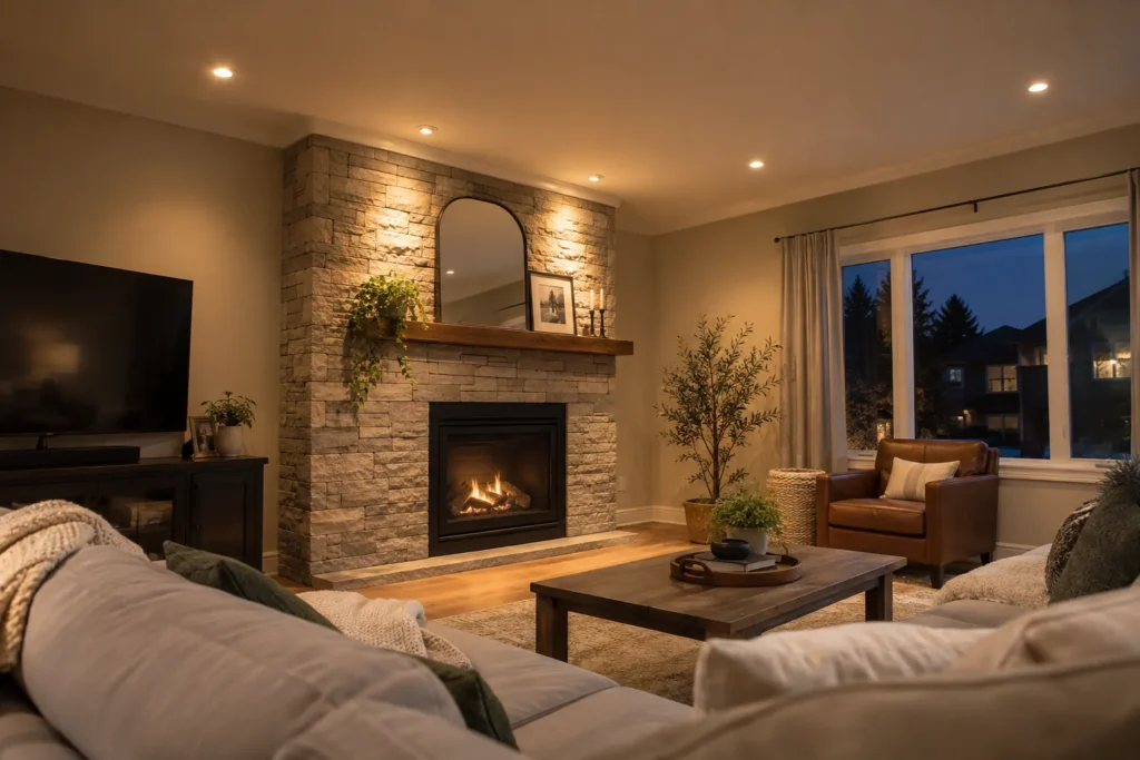
Many households favour warmer light in living rooms because the space is used for conversation and relaxation after dark. Yet a living room also has reading, cleaning, artwork and circulation tasks. A warm general layer can be complemented by a focused reading lamp or controlled accent light. If ceiling fixtures are placed above a sofa at an uncomfortable angle, selecting 3000K will not erase the glare. The beam, trim and position need attention.
A television adds another constraint. A bright reflection in the screen can be frustrating at either colour temperature. Consider a separately controlled light on the wall or route through the room so the main ceiling layer can be dimmed during viewing. Then compare the colour of decorative lamps that remain on. An old very-warm lamp beside new 4000K pot lights may make the mismatch more noticeable than either source alone. The living-room lighting service addresses the room’s full composition.
Kitchen work does not settle the argument
Some people describe 4000K as crisp for food preparation. Others prefer 3000K because it harmonizes with pendants, dining light and warm cabinetry. Neither preference replaces good task lighting. A ceiling pot light placed behind the cook can produce a shadow on the counter, no matter how neutral its colour. Under-cabinet light can bring illumination to the work surface; an island pendant can serve another task or atmosphere. Position and layers should be decided before the Kelvin debate becomes the whole project.
The three layers do not necessarily need identical output or controls, but visible colour differences should be deliberate. Put candidate sources on together and view them from the living area. If counter light is a different white, can you see an abrupt patch on the backsplash? Does the pendant make food and faces look natural? Separate switching can let the crisp work layer turn off during dinner. The kitchen lighting layers guide provides a sequence for making those choices.
Bathrooms require front-facing light
A mirror is a task surface, and the direction of the light is vital. Ceiling light behind a person’s head can create facial shadows at both 3000K and 4000K. Consider how mirror lighting and recessed general lighting work together. Colour rendering is important when viewing skin tone and clothing, but Kelvin alone is not a colour-rendering specification. Ask for the actual product’s colour quality, distribution and suitability for a bathroom’s conditions.
Different bathroom locations can have different exposure to moisture or water. An approved dry-location fixture is not automatically suitable for every position near a shower. The product’s listed application and manufacturer’s instructions need to fit the setting. Ontario ESA publishes recognized approval marks, while the manufacturer documents location suitability. The bathroom lighting service can be planned with both comfort and those installation conditions in mind.
Basements and offices have mixed needs
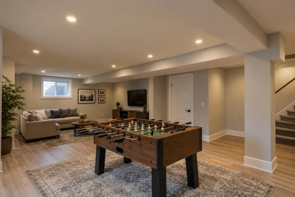
A basement with small windows may be used for exercise in the morning and films at night. A single colour temperature can still work if lighting zones and intensity allow the room to change character. In a low ceiling, an exposed bright disc may be uncomfortable; a different optic or placement can matter more than changing 3000K to 4000K. Paint and flooring also influence appearance. Deep finishes absorb light; reflective surfaces can return it as glare.
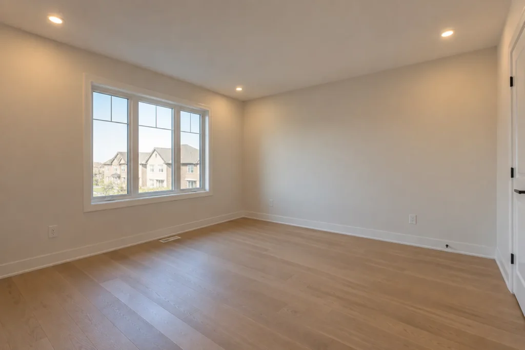
In a home office, a neutral light may appeal for paperwork, while a warmer surrounding area can be easier to live with after work. A dedicated desk source and separate general ceiling zone may be preferable to making an entire family room feel like an office. Check screen reflections from seated eye level. The home-office lighting service treats task and ambient light as different jobs.
Open-plan sight lines change the choice
Stand at one end of a connected kitchen, dining and living area and view all the light sources together. A row of 4000K downlights beside a row of 3000K downlights can look like a mistake unless a clear architectural boundary separates them. A consistent base colour across visible recessed lights often provides continuity, while pendants or task layers can create a purposeful contrast. That is a design approach, not a universal rule. Material palettes and homeowner taste can justify other choices.
Consider the hallway and stair connections too. A warm living room beside a sharply neutral hallway can create an abrupt transition after dark. Lowering intensity may smooth it but will not remove a large colour mismatch. Make a list of the bulbs and integrated fixtures that will remain so a renovation does not leave old and new products fighting each other. If a selectable-colour fixture is used, document the setting chosen at installation.
Exterior white should be judged outdoors
An exterior soffit at 3000K can feel welcoming, but if the beam is intense or aimed at a neighbour’s window it can still be objectionable. A 4000K product may suit certain façades, yet it can appear especially stark when installed repeatedly along the roofline. Test the night view from the sidewalk, driveway and inside looking out. Output, beam control, shielding and operating hours often have more impact than the difference between these two Kelvin ratings.
Choose a product suitable for the actual outdoor exposure and a control scheme that lights the entry and routes when needed without leaving every eave at full output. The soffit layout guide and exterior soffit article provide a fuller approach. Do not use an indoor product outdoors because its colour looks right.
Kelvin is not a brightness rating
Two fixtures labelled 3000K and 4000K may have different rated lumens, beam distributions, diffusers and trims. People can perceive a cooler white as sharper, but that impression should not be substituted for an output comparison. Review the manufacturer’s data and look at light landing on walls and tasks. A concentrated narrow beam can feel more intense under the spot and leave adjoining surfaces dim. A broader one can feel smoother. The quantity guide and spacing guide address those effects.
Product consistency also matters. Two “3000K” fixtures from unrelated manufacturers may not appear identical, and dimming behaviour can differ. Keep a visible row within a suitable product family where possible. Ask for exact model numbers and confirm any substitution before ceiling openings are cut. A nominal four-inch or six-inch size is not enough to establish matching appearance.
Colour rendering and dimming
Colour temperature describes the appearance of the white light; colour rendering concerns how colours of objects appear under that light. Review product data for both. A room with artwork, timber or colourful tile may benefit from a product with convincing rendering at the chosen Kelvin setting. Compare candidate fixtures rather than treating a single specification as proof of a good visual result. A fixture may also look different at very low dimmer settings or respond unevenly if controls are mismatched.
Check the fixture’s driver against the intended dimmer and the existing wiring. Buzzing, flicker and a narrow dimming range are compatibility or electrical symptoms, not a reason to choose a different Kelvin automatically. The LED dimmer compatibility guide explains the questions for the installer. Electrical work in Ontario needs appropriate licensed participation and ESA process as applicable; see ESA requirements.
Make the decision with a short on-site test
Choose candidate approved fixtures with comparable output and beam in the two colour temperatures. Hold the side-by-side comparison on the actual countertop, cabinet, paint or flooring where possible. Look at the result after sunset and with the other sources switched on. Ask which space is primary at that time: energetic task work, social dining or quiet living. Note whether a separate task layer can solve a conflicting preference. Agree on product models, settings and controls in writing.
Is 4000K too cold for a home?
It can feel too cool in some palettes or social spaces, while other rooms and households prefer it. Test it with finishes and adjacent lights rather than accepting a blanket verdict.
Is 3000K too yellow for a kitchen?
Not necessarily. Its appearance varies with product quality and materials, and a separate task layer may address work needs. Compare candidate lights on the real counter after dark.
Can I change Kelvin later?
Some products offer selectable or tunable settings; many fixed-colour integrated fixtures do not. Check the exact product and control arrangement before purchase. Share finish photos when you request a lighting plan.
Share the space, current lighting and the result you want.
Request a Lighting Quote